Pages from the sketchbook
Character Design
We talked a little bit about the art direction of A Summer’s End in a previous blog post. In this post we want to go more in depth on how we came to our current art style and character design.
Since the beginning of our project, we wanted to create a fitting art style that is unique and also paid tribute to our childhood inspirations. As we began looking through all the references of 80s media that was available to us, we realized that there was so much more that we have to learn.
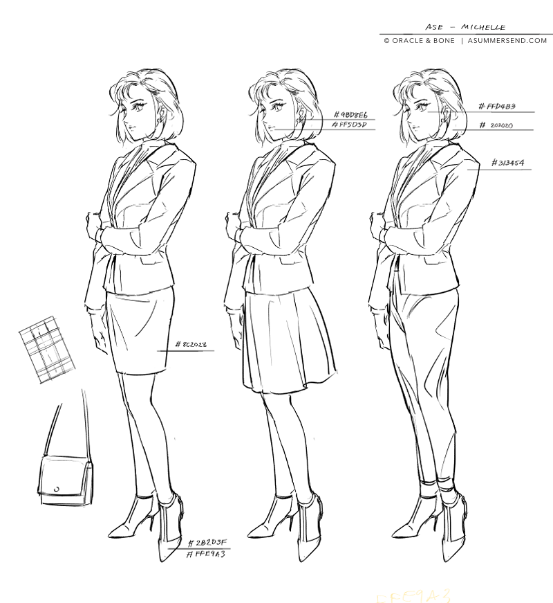
Michelle’s character sheet
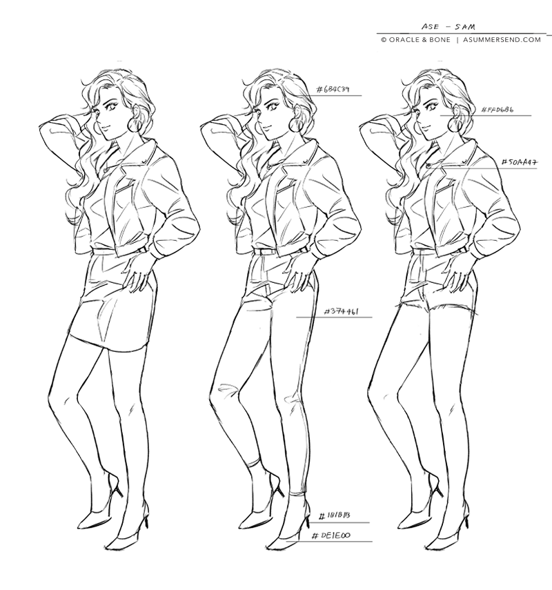
Sam’s character sheet
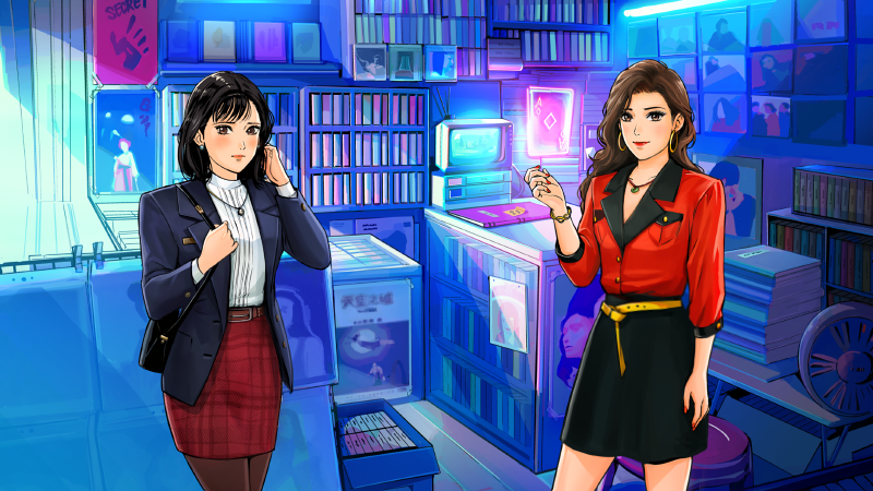
We have made a lot of changes to the art style since we began this project. As you can see that even in the early prototypes of the key designs, the overall silhouettes, character stance and personality, is similar to the final design. We wanted our characters to be recognizable and their personality to show in their designs. Hair, makeup, and styling were important considerations in character design. There were many other prototypes we did. The below images were just some of the examples. We went back to the drawing board many times. We found the early designs did not work well when implemented into a game with full backgrounds. The colour and silhouette of the designs needed to stand out from the vibrant and varied backgrounds that we feature in the game. Some of the other designs we made were too modern and didn’t fit the tone of an 80s game. Note the avatar art appears different from the key design art. The avatar art is a compromise of styles as it needed to fit the widescreen format of our game. Creating a new and original art style from scratch was extremely difficult. We wanted to homage the art style of the 80s, but at the same time we had to adjust the art style to make it look suitable for contemporary audiences.
Some examples of Michelle and Sam’s designs changes throughout initial phases of development.
We have been inspired by anime, printed media, and movies of the time. Our artist for the project grew up in Asia and was fully immersed with 80s and 90s media when she was young. Her earliest impressions and influences on her art style were from 80s anime such as Macross, Kimagure Orange Road, Lupin, Dirty Pair, Gunbuster, GPX Cyber Formula, City Hunter, and Miyazaki's films. For the character design in our game, she wanted to pay homage to her childhood favourites and to the artists who helped influence her art style. Haruhiko Mikimoto, Akemi Takada and Akihiro Yamada are just some notable artists of the time that we want to mention.
Fashion
Fashion is a very important element to our story as it helps set the time period and tell the personality of the character. We've mentioned previously, how we gathered references for our game’s fashion. In this blog, we’ll expand more on the styling choices we made for our main characters.
Michelle is a character that represents a modern working woman of the 80s. During the 80s, power dressing had become a fashion trend as it reflected the rise of women entering the workforce. In Michelle’s case, we wanted her to appear confident and elegant. Monotone suits and shoulder pads were the look of business women of the 80s. The angular shape and straight lines of Michelle’s silhouette help give the look of someone strong and independent. This is contrasted by her casual look where she prefers pastel coloured outfits. Straightforward with a hidden cute side -- that’s how we wanted to present Michelle.
Sam is a character of ever changing looks. She will be seen in different outfits throughout the story of A Summer’s End. We wanted her design to be fun and playful to reflect her personality. Sam is someone outgoing. She could be in a family restaurant, in the disco, and on the road. Her outfits should match her environment. Sam’s overall design features more complex curves and line flow.
The sketches seen above help us present the costume design of our characters in a way that shows both the space between the garment fabric and the body and also the movement of the body within the garment. This is important as it helps us refine the costume design and also serves as a blueprint for when we have to do multiple poses and gestures for our characters. We have to keep in mind that the clothes that our characters wear should be appropriate to their time, culture, their personality, and how we wanted to represent them in the story. Besides our two main characters, we also have other characters we put a lot of thought and design into as well. We hope you look forward to their introductions soon.
We learned during the design process that it is necessary to take a methodological approach. Michelle and Sam’s final design came to be after many revisions. There are many aspects to character design that we had to consider. We hope what we share in these posts offer insight to our development process. There is still much more for us to learn. We’ll continue sharing our updates and development notes in our blogs to come!


