Art Direction
Style and Design
Developing the art style for A Summer’s End was a significant challenge for our team. We wanted to create a style that was original and new, but one that also reflected 1980’s aesthetics and fashion. In this blog post we’ll discuss our influences and our thoughts on design.
Character Art
Isao Yajima’s fashion silhouettes and Hisashi Eguchi’s full-bodied character illustrations helped create a benchmark for the creation of our character art. We looked to popular 80’s anime such as City Hunter and Kimagure Orange Road, and also Hong Kong manhua as visual references for our character design. Creating an original visual style was a process of trial and error. We wanted our designs to highlight the fashion of Hong Kong in the 1980’s.
Early design sketches (2018-2019 Oracle and Bone)
Fashion
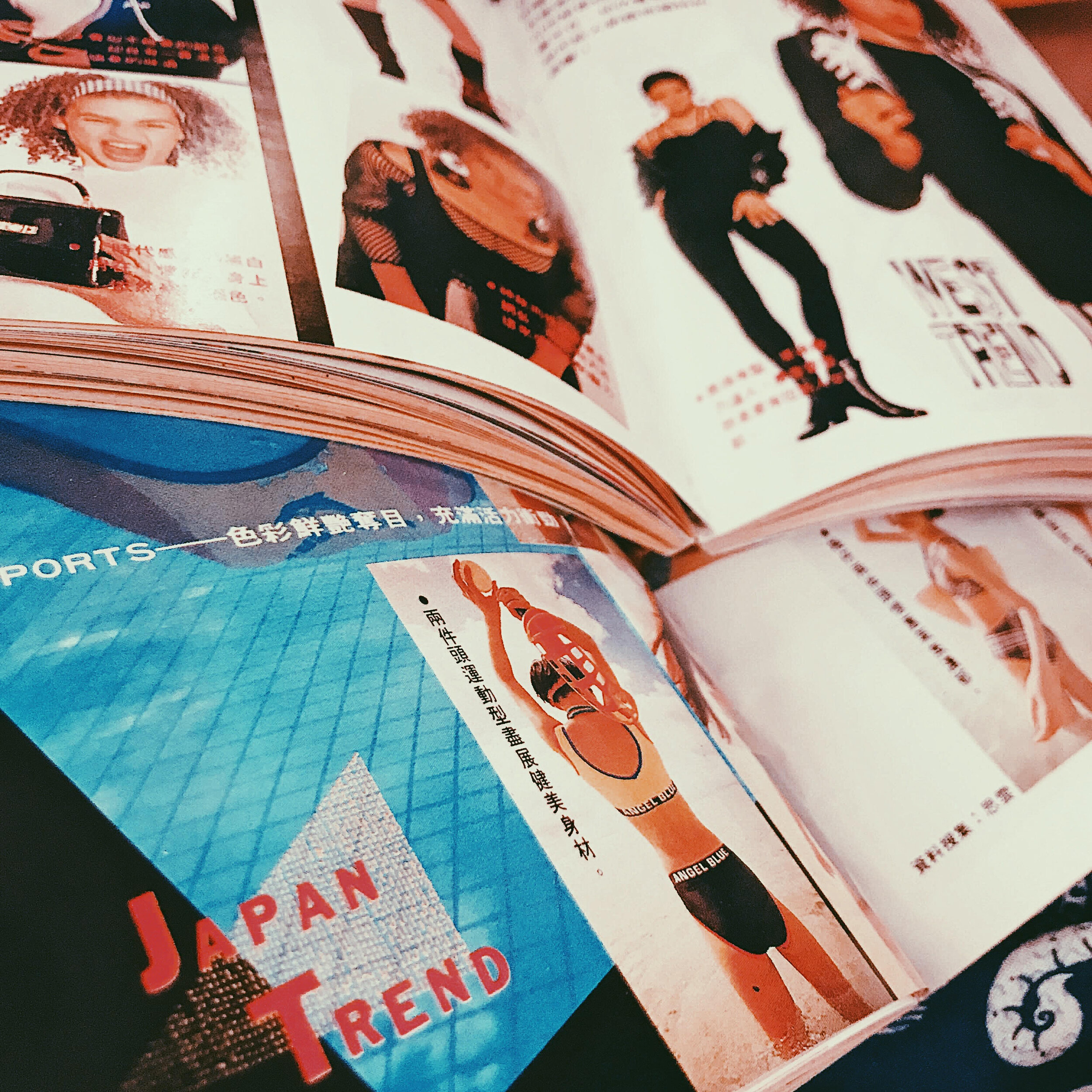
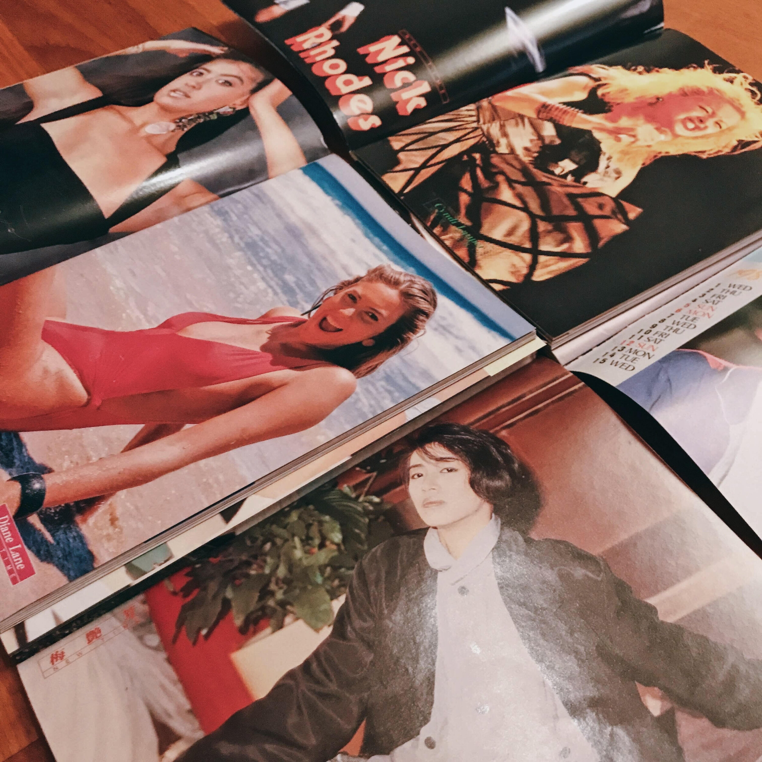
Big, exaggerated, bright, and colourful. These were all descriptors of what defined 80’s fashion. Styling our characters was complex as Hong Kong fashion at the time also took notes from British, American, and Japanese fashion. Our characters were every day ordinary people so the plausibility and practicality in their looks was another factor. All in all, you’ll be sure to find preppy, sporty, and glam elements in our character design. Of course, when thinking about Hong Kong 80’s fashion, we couldn’t overlook the cultural impact of Hong Kong’s own fashion icon, singer, and actress, Anita Mui, as well. Our design process had been a year long effort of gathering information from first person accounts, magazines, movies, and music videos. We did our best to make the fashion an outstanding element of our game. We sincerely hope you’ll look forward to the style and fashion found in A Summer’s End.


